CASE STUDY
CLIENT
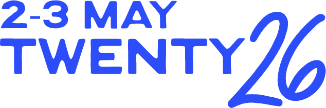
MerriFest
SCOPE
Brand identity, Motion
LOCATION
Melbourne, Naarm
METHOD
AI-assisted Brand Identity
01 — PROJECT BRIEF
A festival that lives in the street needed an identity that does too.
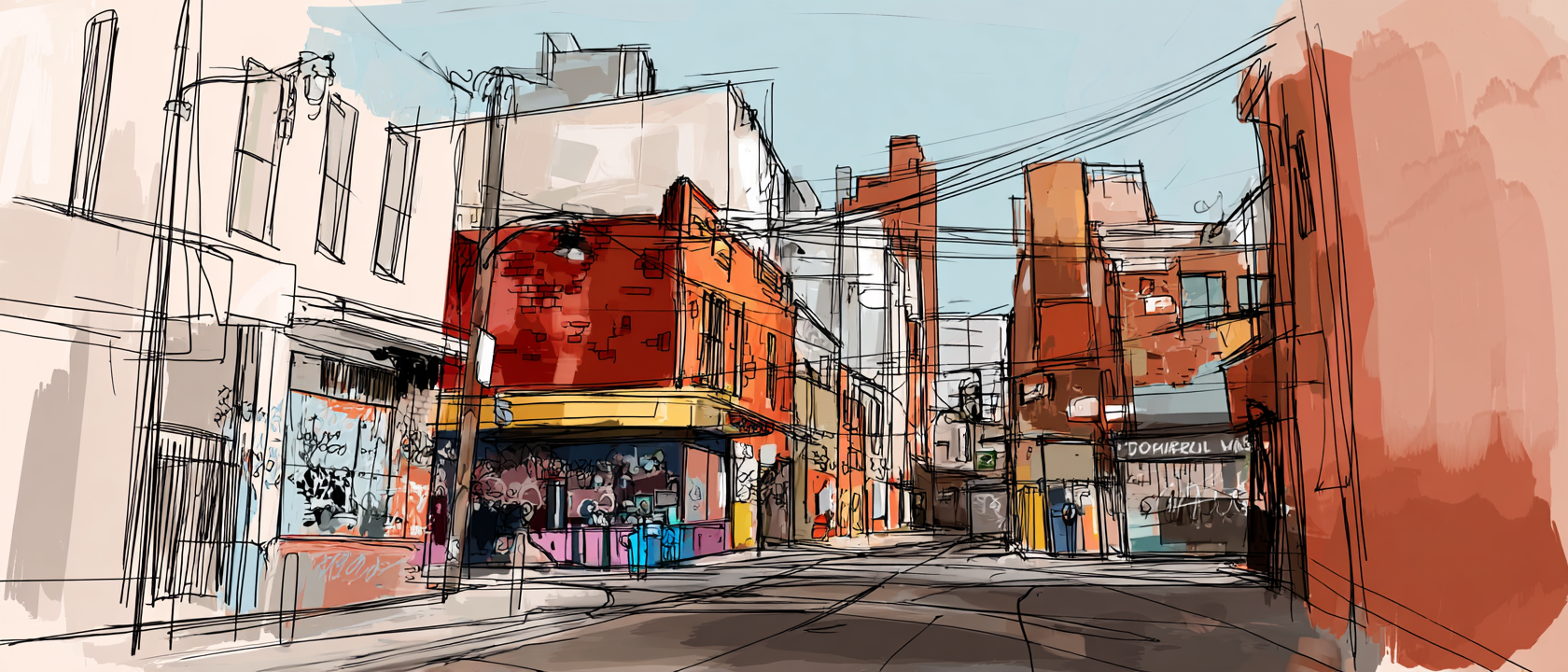
MerriFest is a free, multi-site arts festival spread across the streets, laneways, studios and shopfronts of Melbourne's inner north.
Unlike institutional festivals anchored in a single venue, MerriFest asks its audience to move — to wander, discover, and stumble into culture they didn't plan for.
The brief was to build a brand identity that matched that energy. Not a polished institutional campaign. Not a generic council arts poster. Something that felt alive at street level — bold enough to stop someone mid-commute, warm enough to make them feel welcome, and honest enough to reflect the local community.
The challenge: Treat AI as the primary creative tool without letting it make the creative decisions. A collaborator, not a shortcut. A generator, not a director
What we were solving for
MerriFest sat in white space between institutional credibility, community warmth, and immersive participation. Almost no festival in Victoria owned all three. The brand needed to claim that intersection.
What we were pushing against
Council-tone event posters. Over-designed seriousness. Arts jargon. Anything that made a first-timer feel like they needed a fancy membership to belong.
02 — STRATEGIC PLATFORM
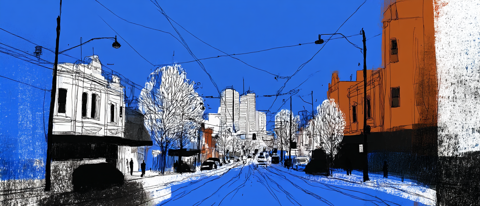
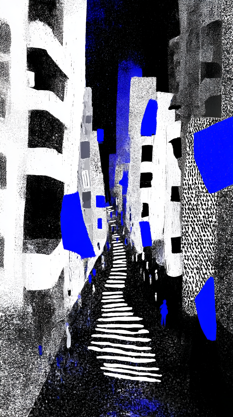
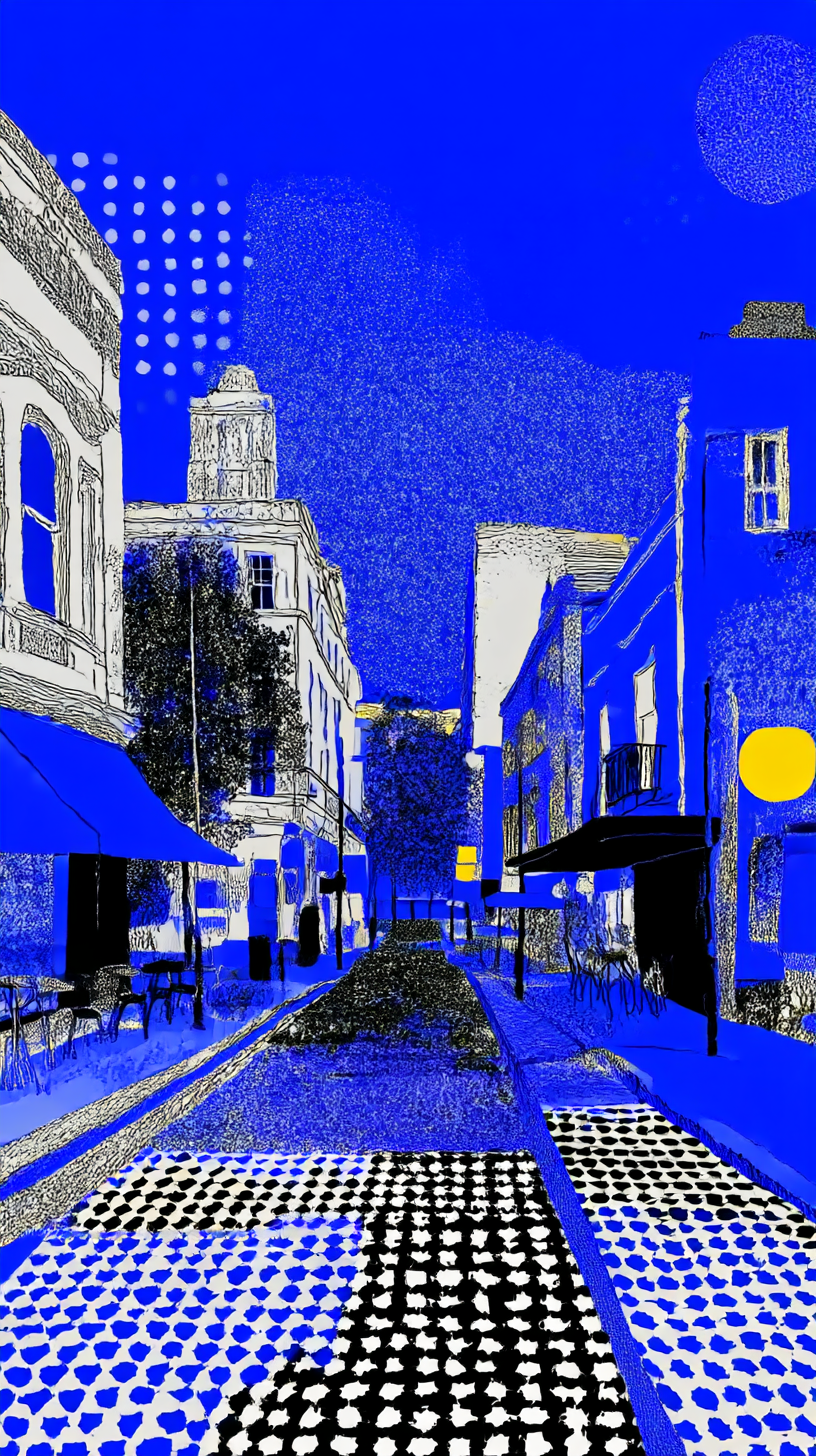
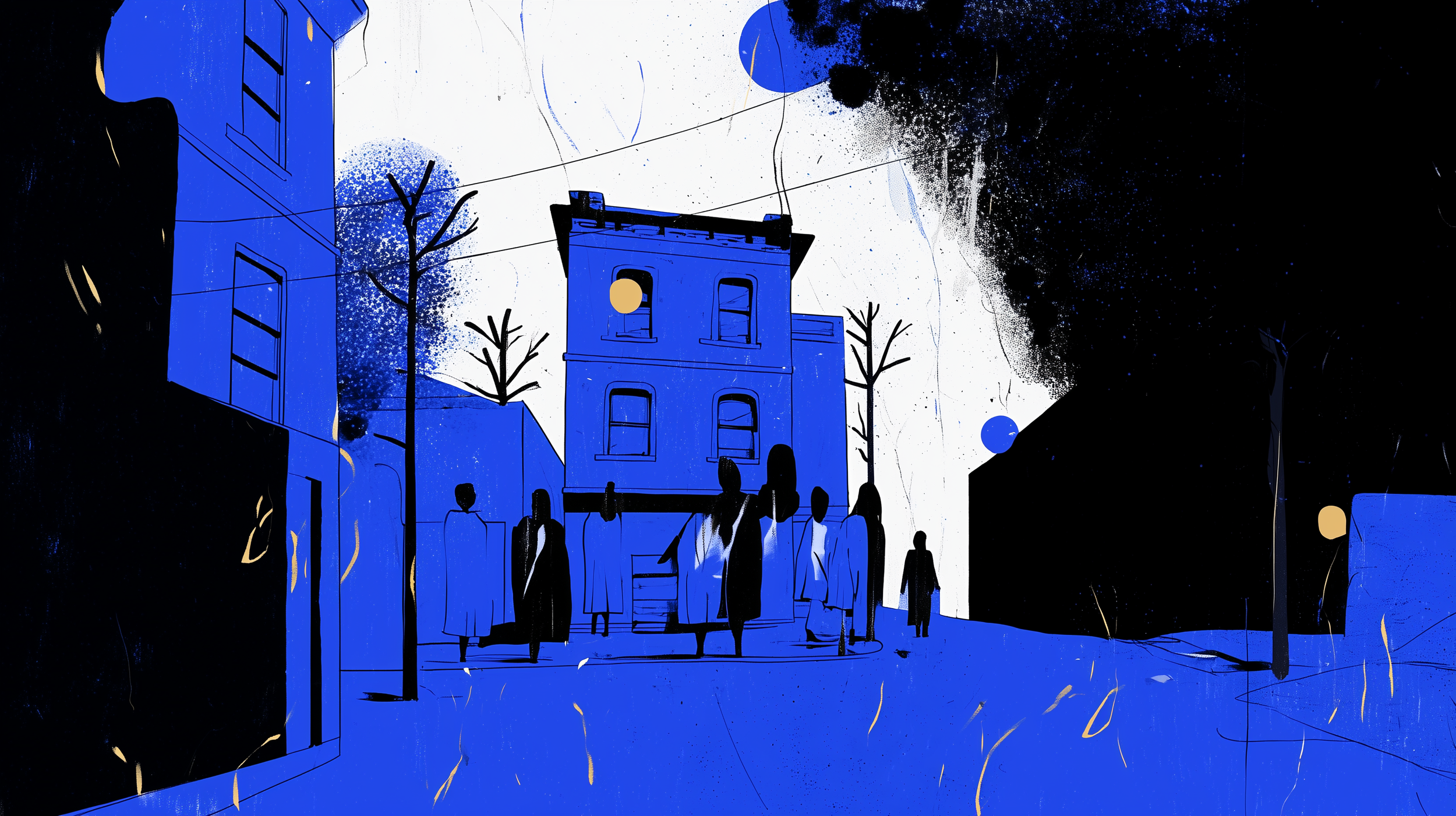
Streetlight static. A neon after-dark identity built for roaming.
The creative platform grew from a single observation: the best things at MerriFest happen after dark, in between places, when you weren't quite looking.
It's black-based, built for discovery in real time. It looks like it belongs on a wall in Brunswick because it does.
From that platform, the brand blends two archetypes — each with a clear human meaning embedded in the colour.
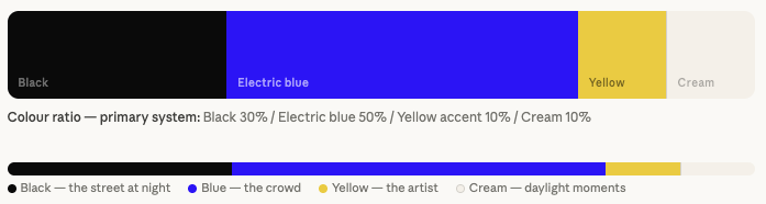
Blue is the crowd, the explorers.
It's the colour-soaked energy of a neighbourhood full of people moving through the night — footprints on footpaths, light spilling from doorways, the blue-hour glow of an inner-north street in full life. When blue dominates an image, the festival is happening.
Yellow is the host, the artists.
A single lit window at 1am. The warm spill of a studio lamp. A musician still at it when the street has gone quiet. Yellow appears as an accent — deliberate, specific, never dominant — because artists are the light source.
Together, this creates a festival that feels:
Curious but grounded.
Playful but thoughtful.
Locally authentic but well-designed.
Inviting, not instructive.
Curated credibility
Neighbourhood activation
Flexible participation
Community accountability
Connection
03 — VISUAL IDENTITY SYSTEM
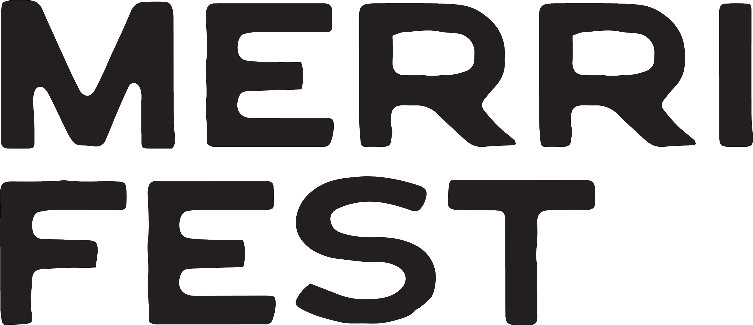
A logotype that earns its distortion.
The MerriFest wordmark is a six-frame morphing logotype — moving from clean and rounded through to cracked, fragmented and angular.
In static use, any frame of the sequence can be deployed independently. The distortion level maps to context: cleaner for wayfinding and digital, more fractured options could be used for motion exploration and raw street applications.
"The festival doesn't happen in a building.
The identity had to work the same way — found on a wall, a tram stop, a laneway corner."
04 — TYPOGRAPHY & SPACING
Type that holds its ground at distance.
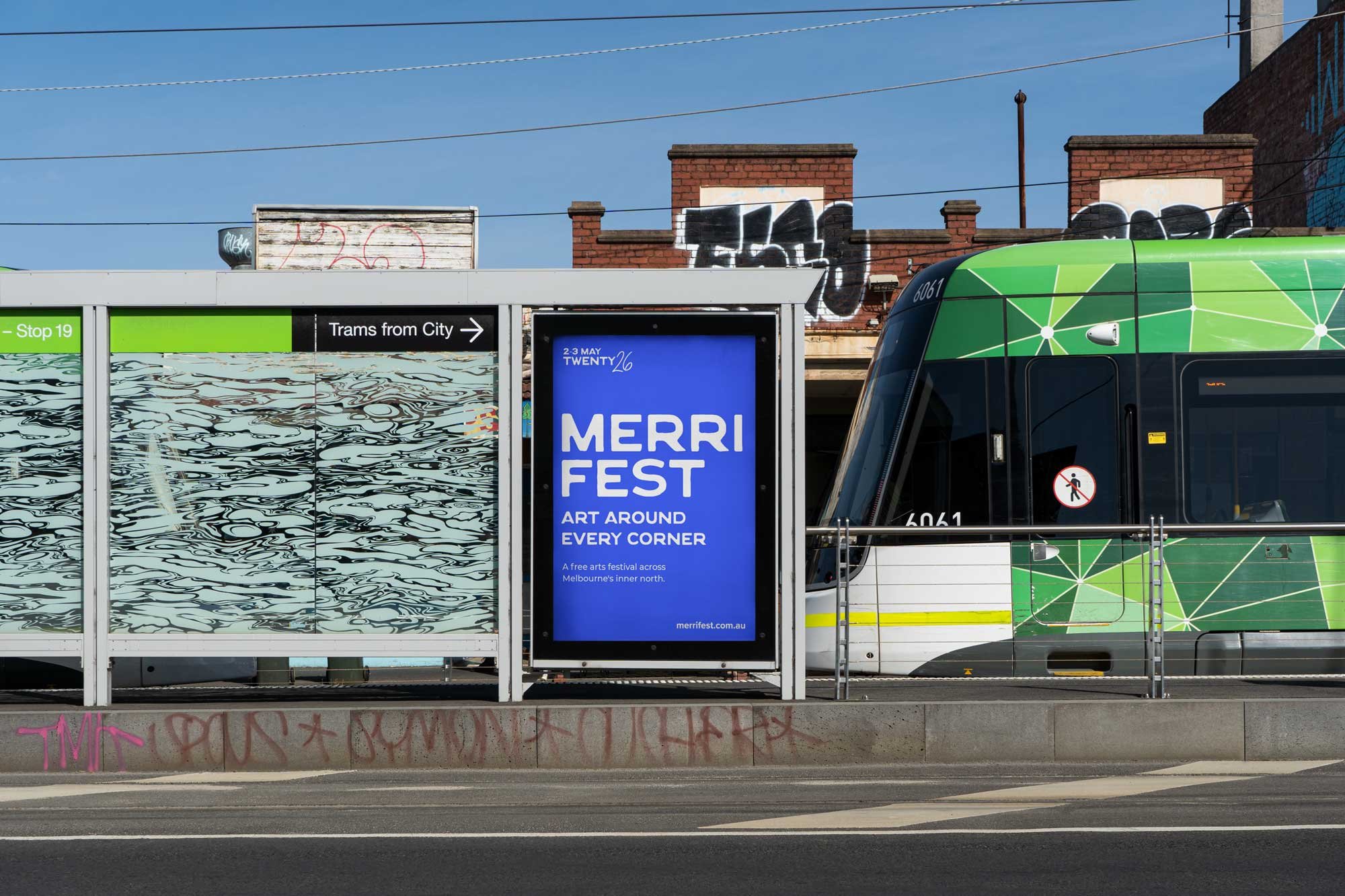
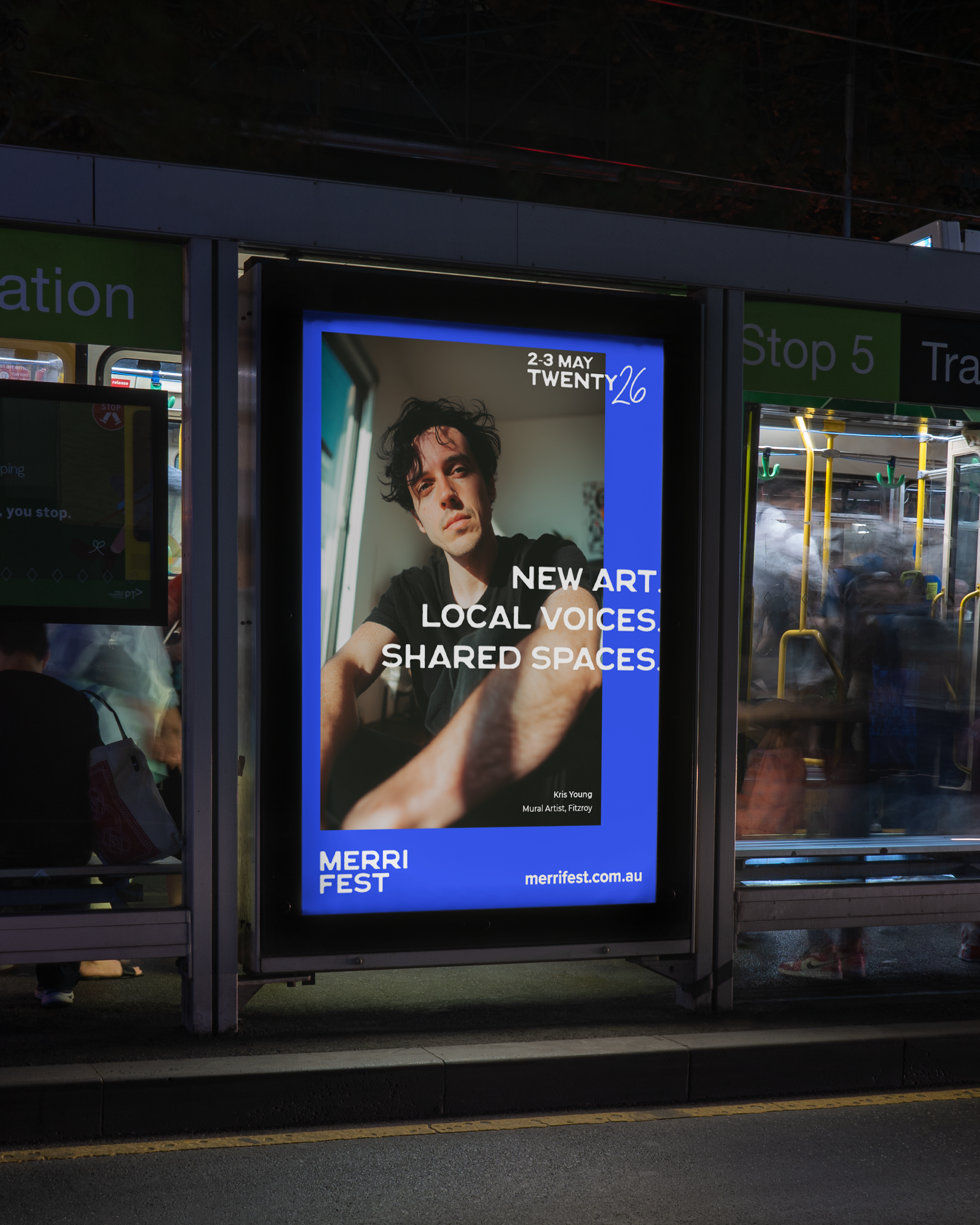
The typographic and simple grid system is built for street-level legibility first — large format posters, bus shelter panels, pasteups.
Spacing system — poster
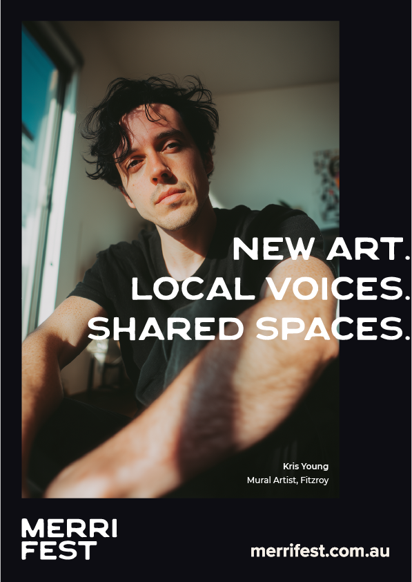
Punchy heading legible and accessible while creating visual interest. Logo anchored bottom left, url bottom right. Small caption inside bottom right corner of artist shots.
Artist photographs natural, as if they’re simple selfies
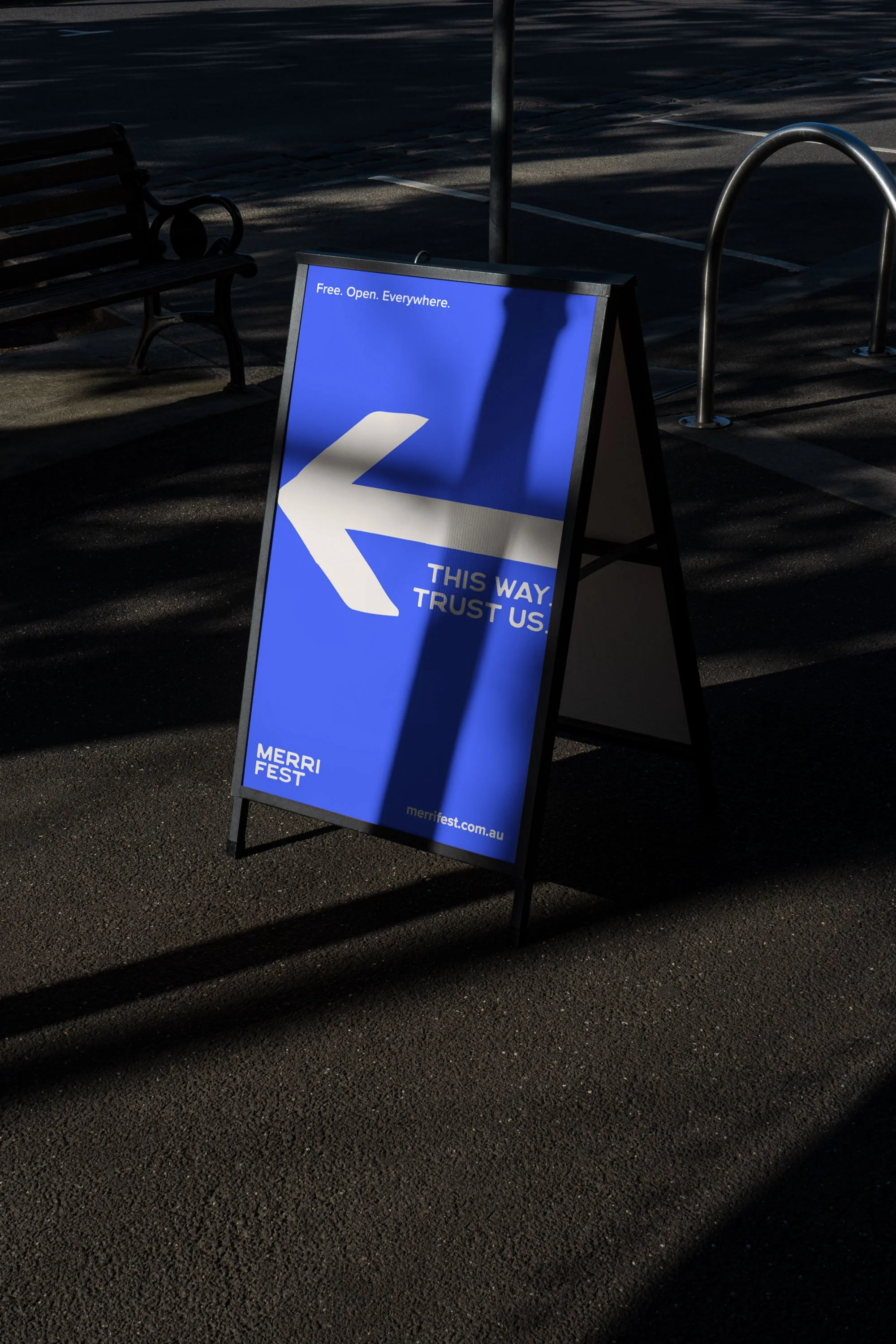
Wayfinding variant
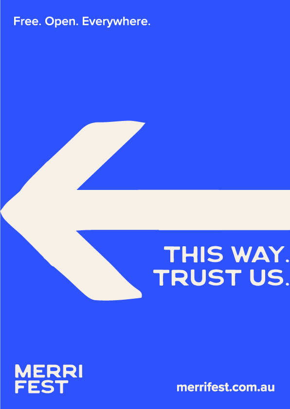
Maximum three words per wayfinding line — "This way. Trust us." does not need explanation. It stays warm, welcoming and accessible.
"Not a gallery. Not a stage. Everywhere."
05 — IMAGERY AND MOTION
The camera stays in the crowd.
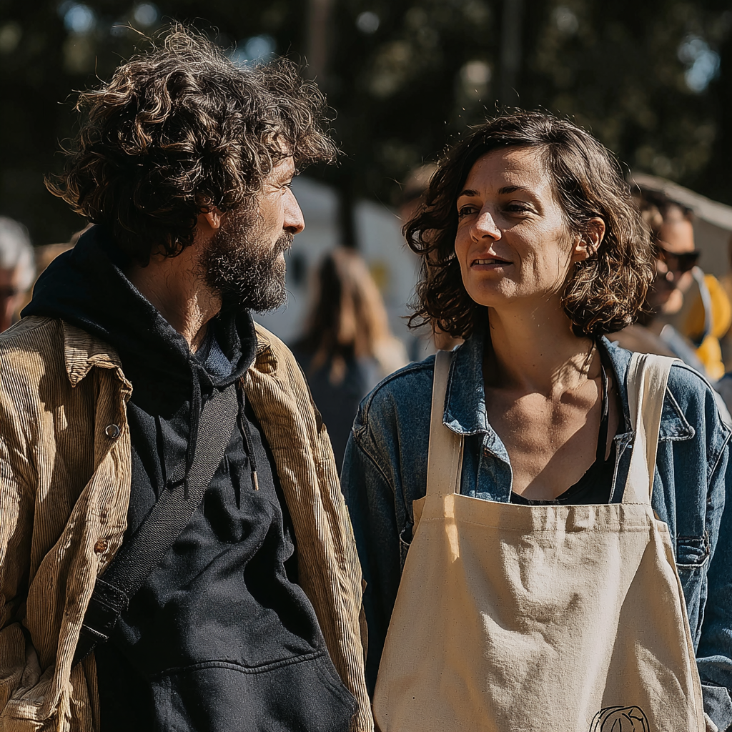
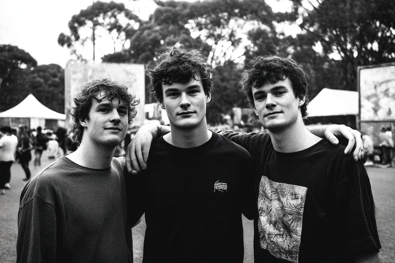
MerriFest's photography runs in two registers.
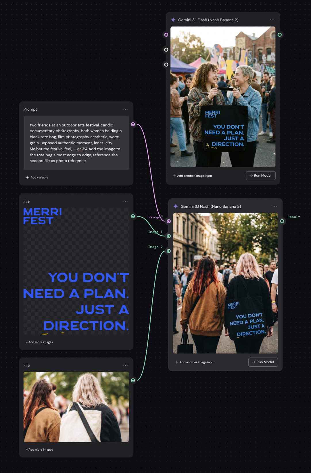
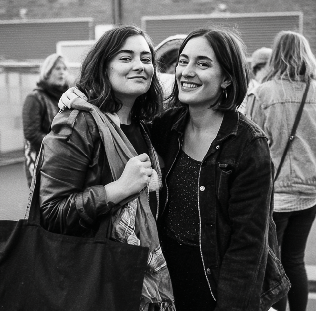
Black and white owns the intimate human moments — the arm around a shoulder, two friends mid-conversation, the tote bag swinging as someone turns to look at something just out of frame.
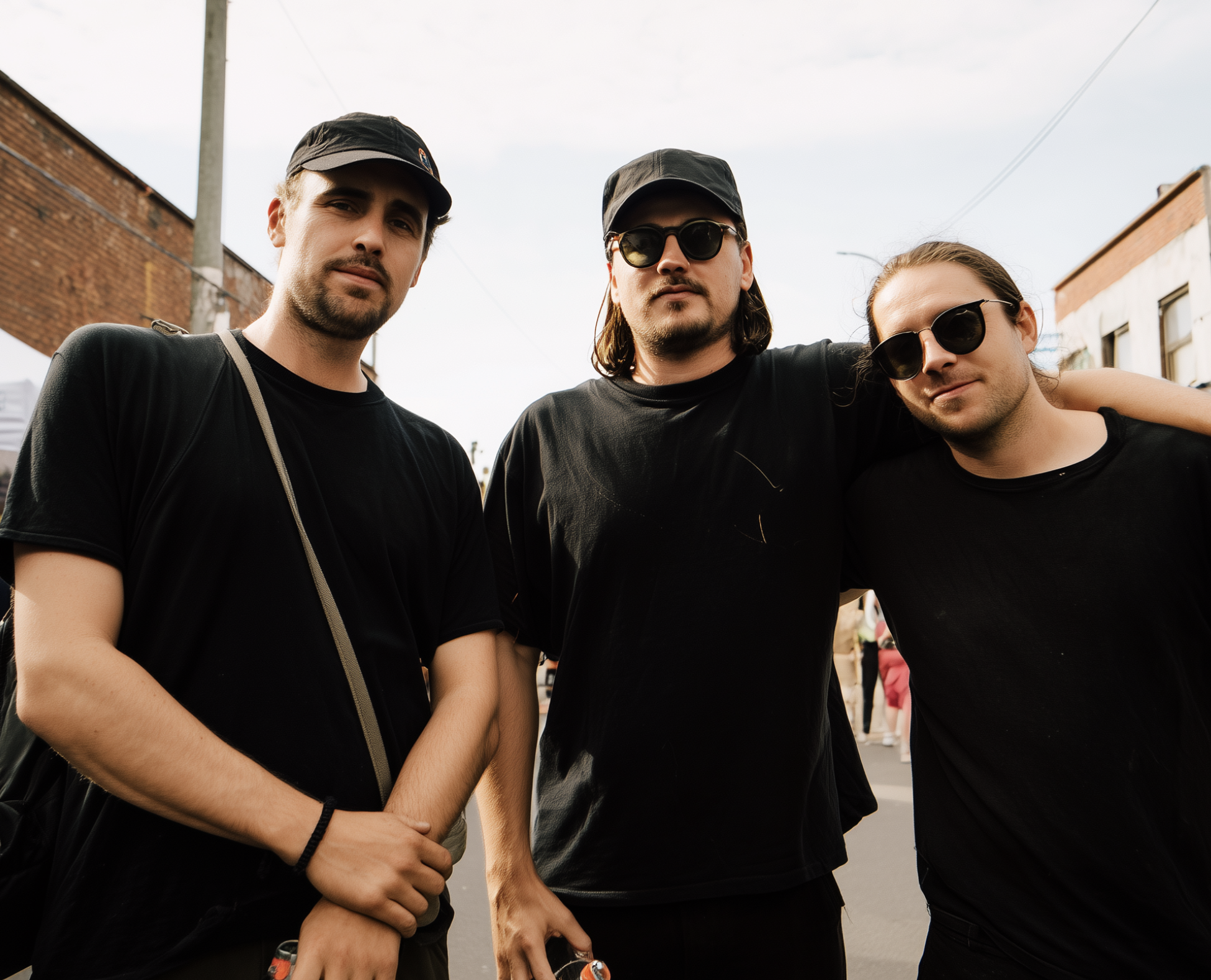
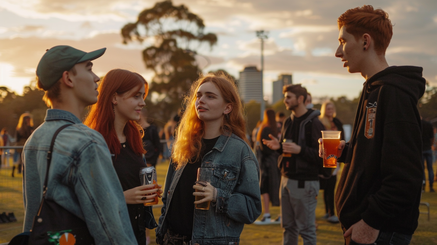
Warm colour owns the ambient neighbourhood energy — golden afternoon light through trees, a crowd moving through a laneway, the unhurried feeling of a Sunday that turned into something.
Both create visual breathing room alongside the high-voltage blue and yellow of the illustrated imagery.


Motion direction — bus shelter & billboard panels.
The streetlight static theme translates directly into motion for bus shelters, billboards and across socials.
Plenty of opportunity to explore the blue flood of colour throughout video, logotype morphing in sync with music and colour changes.
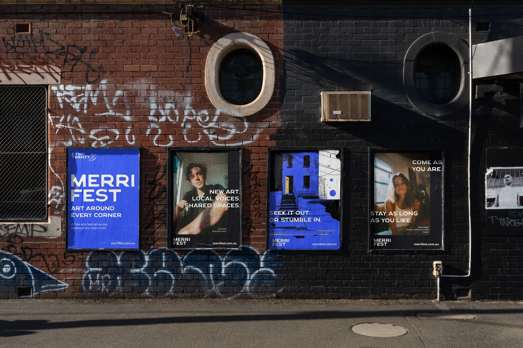
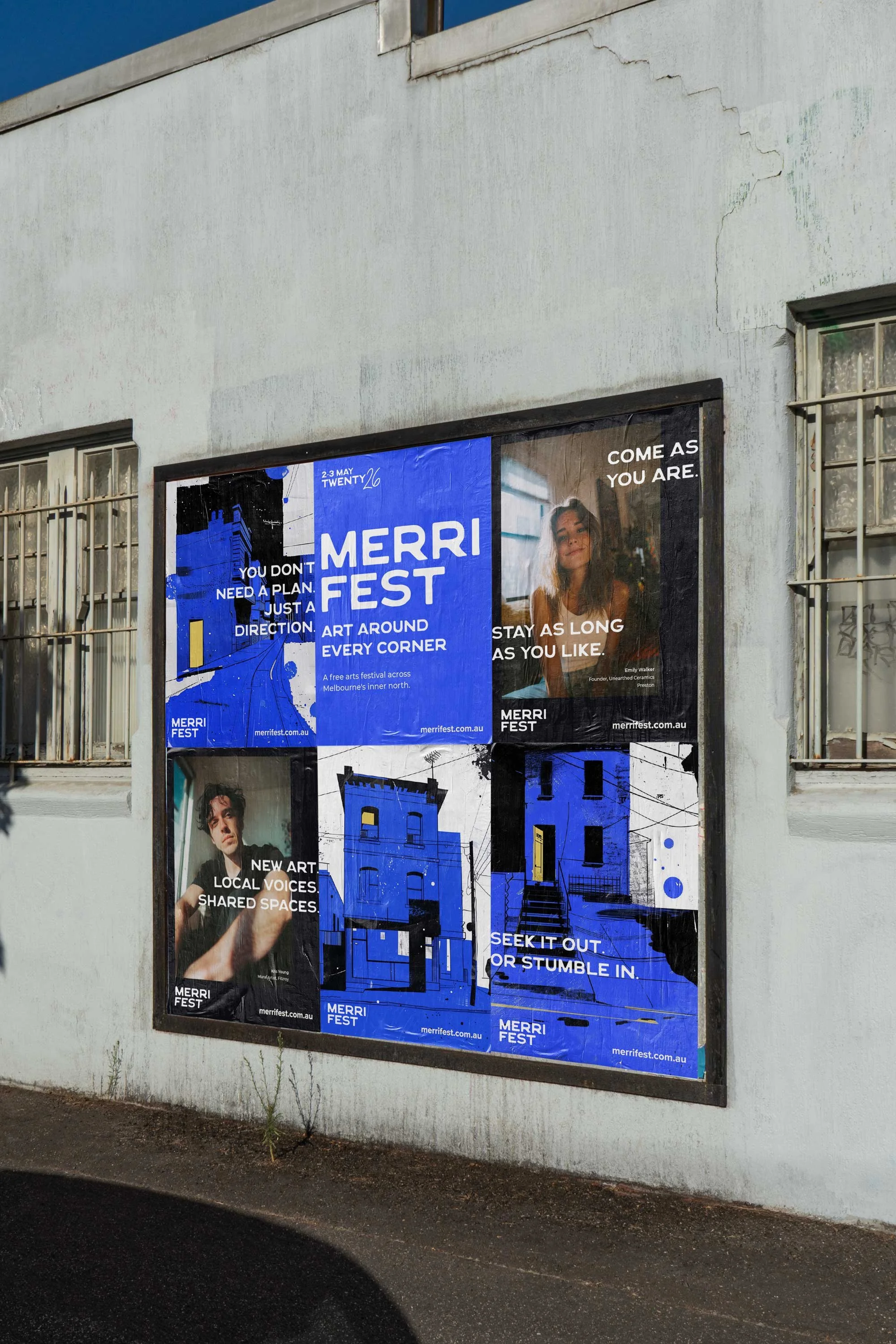
06 — 6 POSTER SERIES IN SITU
Six headlines. Three colours. One neighbourhood.
The poster campaign runs across black, electric blue and cream — three colourways that work as a system when seen together across a neighbourhood but hold independently as single panels. Each poster carries one headline, one byline, and the MerriFest logo. Nothing more.
Street placement is intentional: campaign posters on high-traffic walls and 6-sheet sites, wayfinding posters at tram stops and laneway entry points where the line is doing directional work.
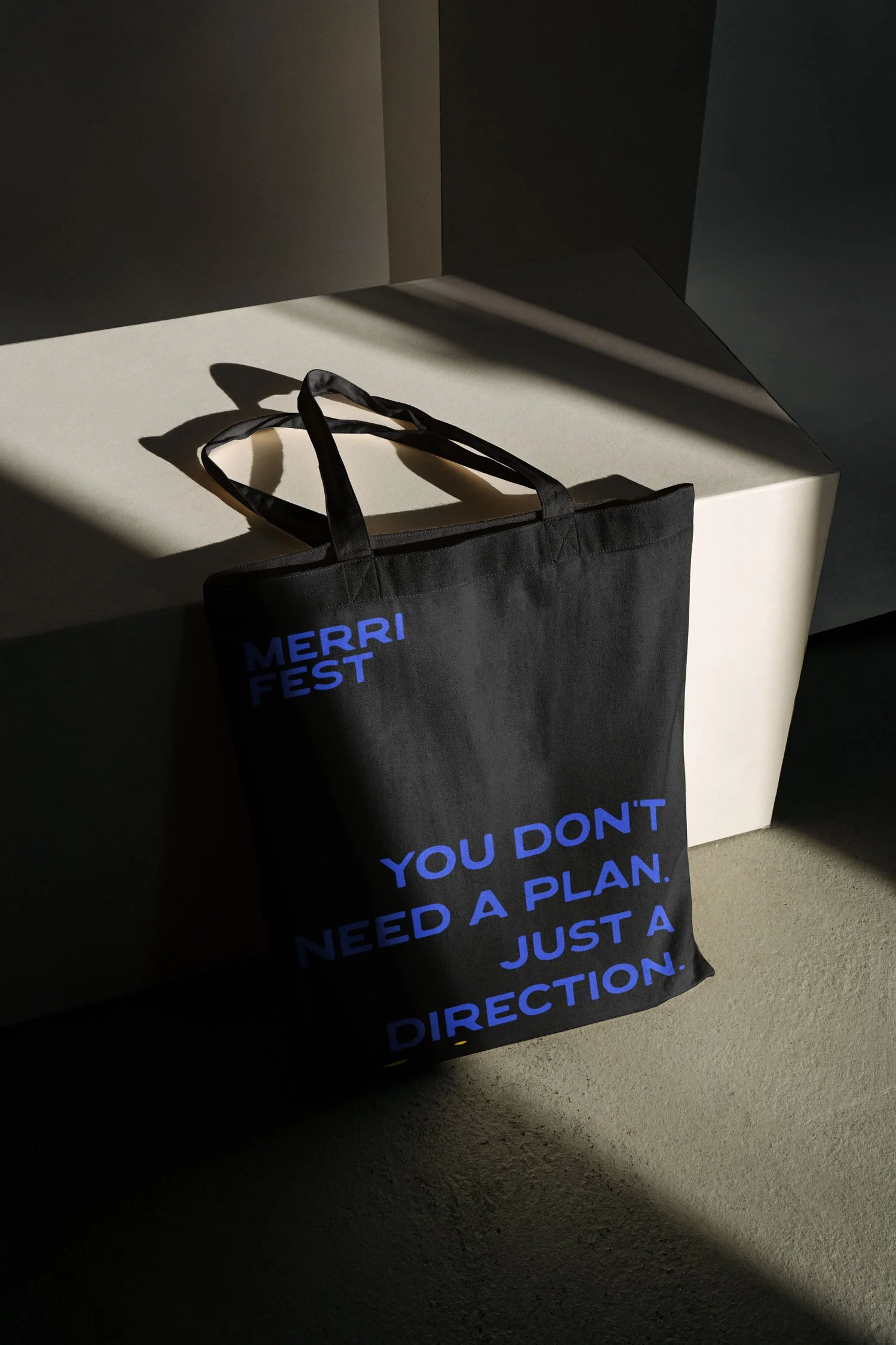
07 — TSHIRT AND TOTE
Two objects. One neighbourhood uniform.
MerriFest merch isn't merchandise in the festival-booth sense. It's the kind of thing someone from Brunswick already owns a version of — a black tote from a local bar, a black shirt from a band they saw at Northcote Social. The goal wasn't to create festival swag. It was to make two objects that earn a place in a wardrobe that already has high standards.
The tote is the typographic piece. The type is the brand. Carried through the neighbourhood during and after the festival, it becomes a moving poster in the crowd.
The shirt is the art object. Black, always. The front carries the MerriFest wordmark — single, clean, yellow on black, left chest. The back is handed to a local artist: one-colour artwork, yellow ink, no brief beyond the festival's spirit. Different artists across different runs. The shirt becomes a collectible.
The tote signals the festival. The shirt signals something more specific — that you were there, and you know who made it.
Stickers. Why? Because #Melbourne.
Ai generated using Weavy. Gemini 3.1

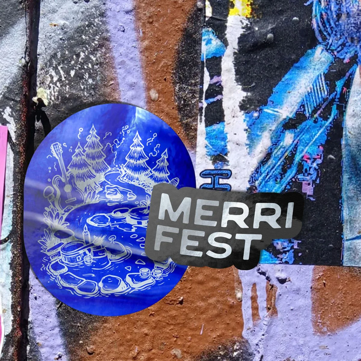
Photoshop mockups
08 — AI PROCESS
AI-assisted design as a genuine creative method — and what that actually means.
This project was built using AI as its primary creative tool — not as a shortcut, but as a way of moving faster from strategy to visual output while keeping human judgment at every decision point. The workflow moved from brand strategy through campaign headlines, image prompting, logotype development and motion direction, with AI active at each stage. The honest version of that story includes the failures.
Hands. Always the hands. Tote bag lifestyle shots consistently produced incorrect geometry — too many fingers, fused knuckles, impossible positions. The held-bag shot required several generations before a usable frame emerged. Well documented issue. Still not solved.
Prompts specifying diverse groups — different ethnicities, ages, body types — consistently produced people who looked like they could be related. The model defaults toward family resemblance even when instructed otherwise.
Beauty standards baked in. Prompts for everyday women produced conventionally beautiful women with tasteful freckles. Achieving images of women who looked genuinely unremarkable — in the best sense — required explicit negative prompting and repeated curation. For a community-facing campaign where representation matters, this is not a small problem.


A few failed generations of which there were many!
The messy middle